Zehnai Living: Rebuilding a Reference Site Without Flattening It
What we learned rebuilding a residential website in Next.js: study the motion before the pixels, change identity without redrawing the layout, and say plainly which parts of the work are ours.

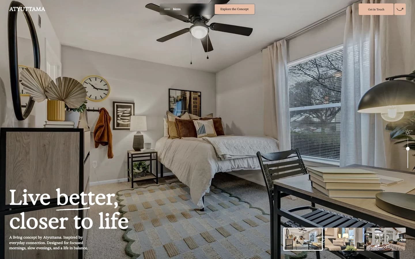
Zehnai Living started as a study, not a pitch. The brief was narrow: take the 21Oaks residential website, figure out how it actually behaves, and rebuild that experience inside a local Next.js app. Later it picked up a Zehnai-branded identity and a warmer palette. It is a reference adaptation and an implementation exercise. It is not an original property brand, and no client paid for it.
You cannot study a site from a screenshot
A hero image tells you almost nothing about how a page feels. The reference runs on interaction: you pick a room, you dim a lamp, the gallery changes scenes as you scroll, apartment cards stack and reflow, and a floating nav follows you down the page. Those pieces set the tempo. Take any one of them out and the site reads like a brochure.
So the first pass was behavioral. We walked the desktop layout and the mobile layout separately, noted where images and copy trade places, and marked which transitions carried meaning versus which were decoration. That inventory decided the build order.
- Room selection — the primary navigation metaphor, not a filter
- Lamp-light control — a small state toggle that changes the mood of the whole scene
- Scroll-driven gallery — timing matters more than the images themselves
- Apartment cards — the densest text block, and the first thing to break on narrow screens
- Floating nav — persistent, so it constrains every section below it
The implementation places the reference sections inside a Next.js page, with the original styles and animation libraries loaded locally. React renders content; the retained runtime drives the established interactions. Calling this a component-by-component redesign would be dishonest. The value is in the migration, the restraint, and the testing that followed.
The redesign that missed the brief
Partway through, we chased a broader creative-portfolio direction. New hierarchy, new image language, new composition. It looked good on its own terms and it was wrong. The brief asked us to preserve an experience, and we had quietly replaced it.
We reverted to the earlier implementation and cut the change down to color and context. The takeaway has outlasted the project.
Changing the identity, not the geometry
The accepted palette trades lavender for terracotta accents over a soft ivory ground. Typography, room photography, section order, and motion stay inside the reference language. We rewrote the names and location copy, removed the original property’s contact and booking destinations, and labeled the site clearly as a residential showcase. Sample rates and spaces are illustrative. The demo does not accept rental applications.
Copy length turned out to be a layout constraint. In a tightly composed grid, an extra clause becomes an extra line, and an extra line on a phone pushes a card past its container. We shortened the phrases instead of loosening the geometry. That kept the identity update from leaking into the composition we were supposed to protect.
Test the experience, not the build
The production build passed. That is the floor, not the finish line. We ran browser checks at desktop and mobile widths covering room selection, menu behavior, local navigation targets, and horizontal overflow, then reviewed the hero and footer by eye.
These checks are bounded and we say so. They do not prove identical behavior across every browser or physical device, and the embedded in-app browser hit a media-playback limitation during local testing. Naming a gap is more useful than implying coverage we did not have.
Be precise about whose work this is
The original design and imagery belong to 21Oaks, whose site credits Artemii Lebedev. Exposure is the retained typeface. Recoloring a palette, porting to a new framework, or converting a font format does not make third-party material original. So the case study credits the reference up front and describes only what we did: implementation, restrained adaptation, and responsive verification. A commercial build for a client would need its own photography, its own copy, and properly licensed assets.
What the demo is good for is a conversation. Someone can open it, feel the pacing, move through the rooms, and tell us whether that kind of interaction belongs on their own site. The case study explains the process. The demo settles the argument faster than a deck would.
Primary sources
First-party documentation and announcements used to ground this field note.